
Did I say I'd have that armoire "after" posting the day after Part I?! Silly me. I should know by now that "the best laid schemes of mice and men oft go awry (Robert Burns)"! Seriously, I thought I'd have it up and posted by Saturday, but the unexpected happened. I'm done but a little behind getting the post up. So, I thought I'd share an example of how profoundly people are affected by color. I had an awesome example pop into my head today as I frantically tried to get from A to B to C to D....without falling off the hamster wheel (lame, but exactly how I felt!).
If you have read much of my blog, you know I am a "market research analyst" in an unofficial capacity these days and one of my favorite topics is color and how it impacts people on both the conscious and sub-conscience levels. I try to carry that over into my furniture and room makeovers when possible ...because this is a business as well as a passion of mine.
Here's a perfect example of how color has more impact than most people realize:

They are essentially the same product made by different labels. Being a mom of picky kids who'd rather starve to death rather than eat anything healthy, I've hunted for every possible option to sneak in some vitamins where ever possible. V8 Fusion has been one of my standbys even though they are getting a pretty hefty dose of natural sugars as well.
I thought I'd try switching it up on them. I found the same basic product for about a dollar less per bottle called Blendz by Nature's Nectar at Aldi's. I slipped it into their glasses at dinner.
Big Guy commented on how much he liked it and asked what was different. Middle Guy decided to try it having no idea it wasn't the same old thing. I messed up and put his in a clear glass. He and Big Guy immediately noticed that the Blendz wasn't the bright red of the V8 Fusion. It is more brown (natural). Immediately the nose turned up and he decided he didn't like it...without even trying it! Following suit, Big Guy suddenly didn't seem so keen on it either...all over the COLOR! Amazing! Funny thing is they taste almost identical. One is just muddier looking:)
Translate this info to your home. See how profoundly a rooms color can impact people?! Color choices can make people want to stay or run. And, it's actually not usually the color so much as the hue that gets messed up. Getting the right tone or shade of a color makes all the difference.
Here's a classic example - yellow:
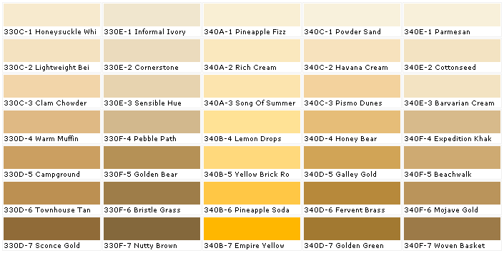
See number 330E-3 Sensible Hue on the color chart below? That would be the soft YELLOW that is on my family room walls!
Perfect example of how color can change drastically from how it looks on the small paint chip versus a large expanse of wall. When in doubt, always go for more muted, grayer, muddier tones and a shade lighter than you actually think you want. Muted colors are softer/more livable and stepping up a shade will keep the color more what you envision versus overpowering.
That doesn't mean be overwhelmed or scared of getting it wrong. Paint is one of the easiest and cheapest things to change in a room that has the greatest impact. So you get it wrong once in a while. We all do. Need some help picking that color(s)? Look at a fabric you love and along the selvage is the printing color test for each of the spot colors. A built-in palette! Or ask the guys behind the counter at a good paint store like Benjamin Moore or Sherwin Williams...not at Lowe's or Home Depot (turn-over is too high). They know what the most popular colors are and if it's popular, there's usually a reason! Check out House Beautiful's website. They list colors designers love in each shade.
There you go. A quick example of how important color is. Take your time. Pick carefully, but don't stress over it. Get help if need be and if you have to redo it, just remember....EVERYONE has had to redo paint at least once!

If you have read much of my blog, you know I am a "market research analyst" in an unofficial capacity these days and one of my favorite topics is color and how it impacts people on both the conscious and sub-conscience levels. I try to carry that over into my furniture and room makeovers when possible ...because this is a business as well as a passion of mine.
Here's a perfect example of how color has more impact than most people realize:
V8 Fusion Strawberry/Banana vs. Blendz Strawberry/Banana

They are essentially the same product made by different labels. Being a mom of picky kids who'd rather starve to death rather than eat anything healthy, I've hunted for every possible option to sneak in some vitamins where ever possible. V8 Fusion has been one of my standbys even though they are getting a pretty hefty dose of natural sugars as well.
I thought I'd try switching it up on them. I found the same basic product for about a dollar less per bottle called Blendz by Nature's Nectar at Aldi's. I slipped it into their glasses at dinner.
 |
| Blendz on the left, V8 Fusion on the right. |
Big Guy commented on how much he liked it and asked what was different. Middle Guy decided to try it having no idea it wasn't the same old thing. I messed up and put his in a clear glass. He and Big Guy immediately noticed that the Blendz wasn't the bright red of the V8 Fusion. It is more brown (natural). Immediately the nose turned up and he decided he didn't like it...without even trying it! Following suit, Big Guy suddenly didn't seem so keen on it either...all over the COLOR! Amazing! Funny thing is they taste almost identical. One is just muddier looking:)
Translate this info to your home. See how profoundly a rooms color can impact people?! Color choices can make people want to stay or run. And, it's actually not usually the color so much as the hue that gets messed up. Getting the right tone or shade of a color makes all the difference.
Here's a classic example - yellow:
 |
| via purehome.com Barry Dixon does yellow right! |
 |
| Yellow gone oh, so wrong! |
See number 330E-3 Sensible Hue on the color chart below? That would be the soft YELLOW that is on my family room walls!
 |
| via materialsworld.com |
 |
| Family room when we moved in...too intense and gold! |
  |
| That's that tan looking color on the chart! Amazing. Sooooo much better and restful! |
That doesn't mean be overwhelmed or scared of getting it wrong. Paint is one of the easiest and cheapest things to change in a room that has the greatest impact. So you get it wrong once in a while. We all do. Need some help picking that color(s)? Look at a fabric you love and along the selvage is the printing color test for each of the spot colors. A built-in palette! Or ask the guys behind the counter at a good paint store like Benjamin Moore or Sherwin Williams...not at Lowe's or Home Depot (turn-over is too high). They know what the most popular colors are and if it's popular, there's usually a reason! Check out House Beautiful's website. They list colors designers love in each shade.
There you go. A quick example of how important color is. Take your time. Pick carefully, but don't stress over it. Get help if need be and if you have to redo it, just remember....EVERYONE has had to redo paint at least once!
Great post and great comparisons.
ReplyDeleteoh interesting! and that drink on the left yeah...ick :/
ReplyDeleteSo true---I spent last week painting my dining room "gray"... and it turned out very, very lavender! Then I painted it true gray (a few drops of black in white) as per a suggestion from Lowe's and it looked blue.... And then I finally got smart and went to a "real" paint store where the consultant knew exactly what my problems were, and nailed my gray color the very first try. I'll probably never buy paint at a big box store again!
ReplyDelete