 |
"Pink Lilly Pad"
B.E. Interiors Photography |
Blogging is a funny animal. It takes a while to find your rhythm and niche. I'm still exploring mine, but the fog is starting to lift and the vision is getting clearer. If I've learned nothing else, it's that regardless of whether I'm any good, I love writing! It's so much fun sharing my photography/design projects/ideas/thoughts! It's now been five months and I'm getting much more comfortable and figuring out some of the quirks, but I've still got a ways to go. You'll probably see the blog changing a little in design (hopefully for the better) now that the boys are back in school and I finally have time to finesse it without much interruption (cue the Hallelujah Chorus!). I'm also learning a lot about myself. Who knew? Self discovery as well as a creative outlet!
 |
"White Lilly Pad"
B.E. Interiors Photography |
One of the things I've learned is I am
truly a design mutt...as I stated early on. I don't have just one style that I stick with. Part of that is due to the aging process. In case you've not noticed, as you get older, your style changes and morphs into something totally different that what it was to begin with. There is also what you like versus what is practical for everyday life. I suspect most of my readers have noticed this evolution in their own life.
When I was younger and sans kids, I loved the glamorous traditional/transitional style. It is so elegant and pretty! But, it has a down side. It's tough to pull off with kids...especially boys! Their idea of inside play is tossing a Nerf football versus a real one! Not making a mess means brushing the crumbs onto the floor or under the pillow before mom sees them on the sofa. Picking up your room means
throwing it all in one of three places: in closet, under the bed, or in the dirty clothes hamper (dirty or not). Cleaning up a spilled SWEET drink means getting the dog to lick it up. You get the idea.
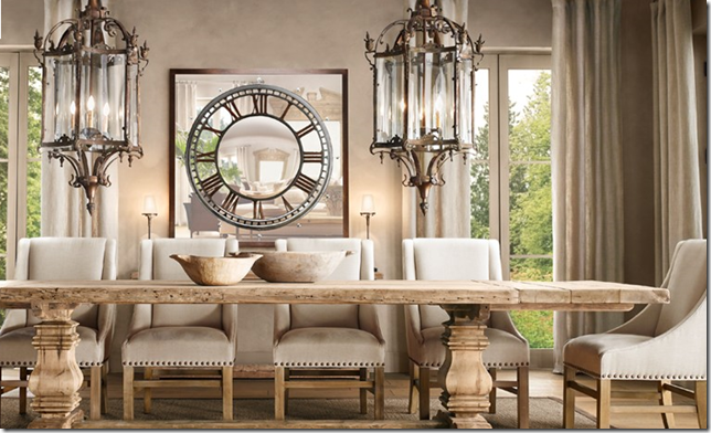
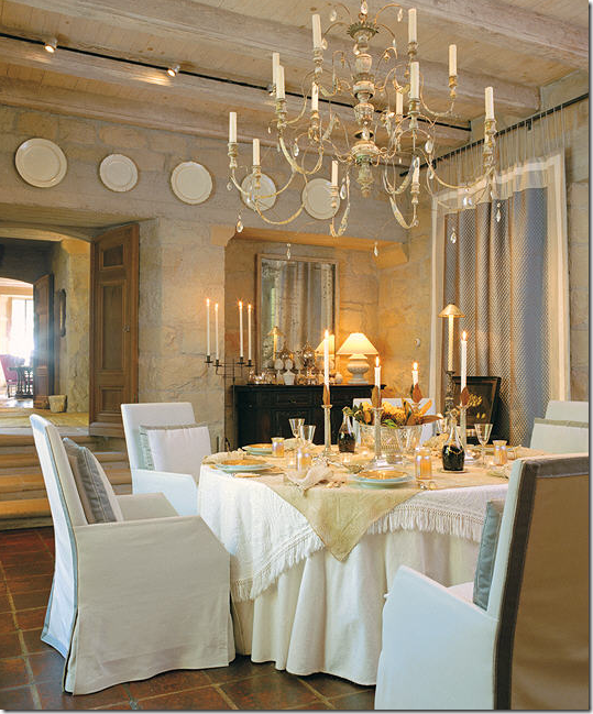
Enter rustic mod country style. It's soooo much more forgiving and easy with kids. As my style evolves, one of the things I find is I initially gravitate to the glam pretty look, then realize it's not functional or practical for our life. It gets revamped and I end up with the more casual rustic look combined with the former - thus my love of the word "juxtaposition". The great thing is that this look is now actually popular! I believe it's called Rough Luxe. Restoration Hardware, Pottery Barn and Wisteria have all embraced this look with arms wide open. It tends to incorporate Scandinavian design, rustic, and old French elegance. Here's some examples of this look, not all of which are exactly me, but they cover the gamut so that you can get a good feel for what this style actually is:
 |
Rough table with formal, yet weatherd wood chairs juxatoposed with parque floors, crystal chandelier and lots of moulding. LOVE this room, although it could use a rug.
via AMI Designs |
 |
| Restoration Hardware has gone hard core rough luxe lately! |

Worn paint on furniture, rough timber beams juxatposed with new fabrics and rug
and traditional accessories. Really like this room as well. |
| Charles Faudree Design |

Crisp new slipcovers/linens and silver juxtaposed with old looking structure of stone/wood
and aged mirror/lighting. Very pretty. |
| via Cote de Texas |
 |
Perfect example of Rough Luxe: farm table, modern glass (shiny) lighting, baroque mirror and crisp white slipcovers. Total mix of old and new.
Mark English Architects |
 |
Modern style sofas/chairs with crisp white slips versus square log tables/stools, rough natural doors, and funky stick chandelier.
Kay Douglas Design |
 |
Transitional sofa, slips, rug, draperies accessories versus rough hewn table and sawhorse legs!
Loving this and the pops of orange.
Christopher Peacock Design |
 |
Perfect. I'll take one please.
Barabara Westbrook Design |
 |
Rough natural cut floors and twiggy chandelier juxtaposed with modern metal/linen(?) chairs,
traditional sofa with white slip and transitional chairs and shiny modern garden stool and art.
via Remodelista |
Rough luxe is basically combining opposites - lots of rough wood and worn finishes mixed in with expensive looking finishes like crystal, silver, gold, mirrors, etc. I love that it's so acceptable now to mix it all up. Rough floors, worn paint and leather, nicked and dinged wood - great for kids. A little shiny, pretty stuff - satisfies Mom's need for style. If I had to stick to one pure design style....well, I'd just be the rebel without a cause - BDD (Bi-polar Decorating Disorder!).


Beautiful spaces I am in love with that space by Kay Douglas Design. Doesnt blogging open up so much more for you to explore I am obssessed with checking peoples blog pages for inspirational images, as if I dont spend enough time on my laptop already. Its so lovely speaking to like minded people though dont you think. I love the lilly images its my favourite flower & the name of my nan. Enjoyed your post today thank you x
ReplyDeleteI especially love the French furniture against the rough tables. I love that Louis XVI chairs are so popular now. I even saw one in Home Goods yesterday!
ReplyDeleteStacy
Love the pics! I had to laugh at the BDD, totally funny. I guess it is a good thing that rough luxe is "in vogue" cause that is how my house has been from the start, by default. Very little of what I have hasn't been around for quite a long time. What hadn't when we got it, has been roughed up by movers and boys. Yes there is the crave for a few "nice" things in a house full of men, but you summed it up good. Enough "nice" for mom's satisfaction, yet comfy and practical to tolerate life. I'm always interested in what you write. You enjoy it and are very good at it, too.
ReplyDeleteRochelle