Showing posts with label paint treatment. Show all posts

Friday, September 16, 2011

Furniture Reburishing: Part I


"The Baroness" Before and After
B.E. Interiors Photography

Everyone has their own way of doing things, but I though it might be fun for you to see what goes on when I'm looking for a piece and what happens when I go through the brainstorming/design phase of recreating a piece of furniture. So many people have really seemed to like my "Baroness" armoire piece...especially the inside. I have a sneaky feeling people would love to know how in the world I come up with that kind of thing. O.k. maybe not. Maybe I'm just flattering myself, so humor me;)

The process actually begins before I even buy. In order for a piece to have potential, I'm looking for a couple of things... although I'm not actually running through a check list in my head:
  1. Over-all condition. Is it in good or easily repairable shape? By that, I mean would a little screw tightening, wood putty, sanding, stain and paint save it? If not, keep walking.
  2. Style. I rarely go out looking for something specific. I try to keep a finger on what appeals to people currently and if I see something with a vein of those same aesthetics (because everything recycles in style) for a good price, I grab it.
  3. Solid wood. No MDF or pressboard here! It's resale value isn't going to be much if it's not solid and it's definitely not going to be worth any real work.
  4. As distasteful as the subject is, these days you have to really look out for little critters on resale pieces. So, I carefully check it over with a tiny LED (bright!) flashlight I carry on my keys. Do a little research to know what you're looking for. I'll leave it at that!
  5. No cigarette smoke! Zinser Bin will cover it, but it's a ton of work and reeks on the way home, leaving a horrid smell in the car. It'd have to be one heck of a beauty to make me buy it!
  6. Detailing. There needs to be some kind of detail that makes it catch my attention...or if it's a minimalist piece...lack of detail which also opens doors to creativity.
  7. Price. I will rarely pay more than $100 for something unless it's in fantastic shape.You have to keep your finger on what a piece will retail for and how much you've got to put into it. Will it make money or is it a piece you really love?
Once I've made up my mind to buy a piece, then the process goes into over-drive. I start thinking about the details that caught my eye.
  1. Is it country, modern or elegant antique? What kind of finish would compliment that style best?
  2. What element do I want to be the main feature?
  3. I shop for some remnant fabric (or use some of my stash) that goes really well with the style of the piece, figure out how I'm going to use it and then draw colors from it.
  4. I then decide which colors would look best with the style of the piece and where would I use each. I usually pull three colors: overall, glaze or stain, and possible accent color.
I'm going to walk you through the crazy chaotic process I call brainstorming with this recently finished piece:
My latest makeover "victim"!

When I look at this armoire, I see fairly clean lines. That means nothing flashy or too ornate will work. I've wanted to use chalk paint again and this is a great piece for that. It needs very minor repairs...just some wood filler, sanding and stain on those places to keep the base a uniform color. I don't have to strip this one if I go with an aged look.

See how the bottom of this veneer is waving and separated from the base? This needs to be fixed or it will easily catch and tear on something making for one unhappy customer...NOT what I'm after! 

I know this piece was originally bought by a man for his personal use, so it's clean lines would likely appeal to men more than some other piece (Ms. Baroness!). That means, don't get frilly. The great thing about not overly masculine pieces is that they also appeal to a lot of women, so don't go TOO masculine either.

Sometimes the initial force directing where I go with the process is just my desire to do a certain look, finish or use a certain fabric. I was wanting to do an aged driftwood-gray, antique look like these pieces:

via DecorPad
 
via interiorconnector.com


via Veranda Magazine
Driftwood gray with an antique gilded look. Hmmm. This would go nicely with the fabric below!
So, knowing that, I'm looking for a fabric that coordinates with that look. Here's what I found to use at my fabric warehouse. It's floral paisley linen. I deliberately went with a muted palette of grays, creams, browns and golds that would appeal to both sexes.

Very neutral and elegant with a hint of gold thread running through it to jazz it up some.
But, I'm not so sure. If you know me, you know I like some color and I started hunting through my stash for some other slightly more colorful option that could potentially appeal to both sexes, and I stumbled upon these. Remember my purple (or plum as I like to call it) fabric I fell in love with a couple of months ago that is so out of my normal color zone? I have both stripes and floral that coordinate... plenty of it. It is still muted, but a little more lively. Hmmmm.....which to use? Play it safe or live on the edge? Muted and elegant or fresh and casual?

The "masculine" version.

The complimentary "feminine" version.
I plan to line the drawers and the inside of the cabinet areas with fabric. People often don't go past the outside, but I always pull open drawers and doors when I'm looking to buy a piece. I want my furniture interiors to stand out and be like a jewel inside the box! That's the part that only the owner will usually see, so I want to make them smile every time they look at it.

Now that I have my fabric and I know I want that aged gray color, I decide on my paint and  finishing method. A smart person would do a test board, but I'm living dangerously and just going with my gut instinct on this one. Hopefully it will turn out like I picture it will in my head! A smart person would also perfect one method and stick with it...I always have to try something new so it's a constant learning curve:)

My paints and finishes to achieve my "weathered driftwood" look.

Last, but not least, I look for some hardware that will compliment the furniture style, paint and fabric. Sometimes I just reuse the existing pieces. On this piece, I plan to reuse the pulls, but since I'm missing a knob, replace the knobs. That means they've got to coordinate with the pulls. So, I think I'll go with these:

Exiting drawer pulls that I plan to reuse. The ribbed handle is actually shown with bottom side up here. I like that better than just the plain smooth other side...has more character. So, I'm rotating them so that the ribbed side is up.

New knobs for the doors purchased from Hobby Lobby.

Now that I've made all the decisions, it's time to pull it all together.

There you go. That's the way I work through the planning stages with a new piece. Now, sometimes surprises come up, I run out of stuff or have to change paths midstream because something just isn't "working", which is what may happen with the fabric choice here.  You've got to be flexible. If you get too set on a plan, then you are up against a wall when those issues pop up. Honestly, this is the hardest but most exciting part. I love the planning stage. It's when you're knee deep in the process that sometimes your patience can be tested. Bearing any surprises, I'll now buckle down and "git 'er dun"!

So, until tomorrow, I'll leave you to imagine what the finished armoire will look like.


p.s. Running spell check BEFORE hitting the publish button is always a good idea. Unfortunately, I am too tired tonight to use my good ideas! Oh, well. Better late than never:)

Tuesday, August 9, 2011

Caution: Dining Room in Progress!

Warning: This post is just kind-of all over the place...kind of like the evening news...with updates.

No, this is NOT my dining room OR my laundry room, but it has me completely inspired that an open hall concept could work for my one day laundry reno!

I just gotta share something from my personal life, which I try and leave out of blogging for the most part. This summer I haven't accomplished one of my big goals - redoing my laundry room. The main reason was little bro, who was supposed to come up and help take out THE wall, went and got himself a really good job...as a passenger pilot for Delta and is now based out of Detroit. That's just a little far away for a "weekend reno". Go little bro! I'm incredibly proud of him (although terrified at the same time!). I think I can forgive having to wait on the laundry redo for that:)

My little brother...who towers over me...seriously by about a foot!
Can I just tell you how surreal it is to see the kid you remember in diapers dressed like this?!
So, what about my other projects in the works? Did you think I'd forgotten about my dining room? Nope, it just had to wait a little while for vacation and for me to get some pieces down to the booth. Now, I'm hitting it hard this week to knock out painting the walls. I did manage to score some great fabric for the new curtains since the original fabric I'd planned to use was just a yard or two short and have gotten them temporarily hung. I'm really restraining myself with this room and keeping it simple and fairly neutral. What do you think?


The pattern is very subtle.


The material is a soft green with a very slight shimmer. It has a very subtle various size kinda' mod daisy shape pattern in various shades of gold, super pale blue, and cream. It continues the green that is in the family room and kitchen but only in the fabric. That way it's not overwhelming. The pale blue ties in the ceiling and blue accents in the other adjoining rooms. Gotta love open floor plans and having to tie it all together!

New ceiling color. I'm loving this!

I'm planning to do some small accents in this lovely coppery-orange shantung throughout all three adjoining spaces to add warmth and liven them up a little:


Kay Unger dress via http://www.bluefly.com/
These three rooms use the amount of orange I'm looking to incorporate and are serving inspiration right now.

via Verdigris Vie


via House of Turquoise

via Suzanne Kesler


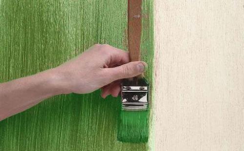
I'm really torn with this room on what to do with those walls. I'm dying to put some blue on the walls, but I'm trying hard to keep it fairly neutral. So, I've decided to go with a dragging technique in a slightly darker creamy pearl metallic over the base of creamy white already up there. That way, I shouldn't have to repaint...possibly ever (right!) - just change out accessories. Although this example is green, this is the look I'm going for. Imagine a pearlescent cream over white:

Dragging Paint Method

Dragging Paint Technique

Step 1. Before you begin, carefully tape off all areas where you do not want to apply the finish. Apply Valspar base coat to the entire surface with a roller. Remove tape. Allow to dry overnight.
Step 2. Reapply tape. Apply selected glaze with a roller. Work in wall sections no wider than 4-6 ft. at a time so the glaze does not dry too quickly. Maintain a wet edge from section to section to prevent lap marks. Only stop at the end of a wall.
Step 3. Using a dragging brush and holding bristles parallel to surface, drag the brush down through the wet glaze. Work from top to bottom, holding the bristles of the brush against surface with handle tilted slightly toward you. This keeps the bristles rigid, creating the streaked look. Wipe excess glaze from the brush after each downward pass to ensure a dry brushing surface. Remove tape within an hour and allow to dry.

Just thought I'd throw the directions in there for fun. We'll see if I have any tips to add when I get done!
I've also been collecting branches to play with the chandelier transformation when time permits, and the slipcovers are still in process. This room is not a top priority right now so I have to just take it bits at a time. Sometimes I feel like such a yo-yo because I have to bounce between home decor updates and keeping up my booth with furniture redos. I'm dying to finally pull it all together because when school starts up, the kitchen is next in the line of attack!

Although not planned, the room has suddenly begun to remind me a lot of this room!
via Suzanne Kesler
Last, but not least, I am trying to narrow down rug options. I love seagrass and have that in my family room...which is open to the dining room. I've contemplated that again, but don't think I want that under a table with kids. I may look for a carpet remnant at the carpet place (hubby's high school friend owns it!). I've also contemplated doing the carpet tiles from FLOR. I love those, just not sure I want to pay that much. This is one of times when I realize I'll get what I pay for, so I'll probably not skimp too much. It's gotta last. The more I look, the more likely I'll get an indoor/outdoor carpet like one of these. Lot's of wear in this room...even if it's not usually dining (kids, dog, me...you name it!):

Lyrical by Home Decorators Collection
I'm in love with this but wonder if I'd tire of it quickly. I does a great job of tying the ceiling, walls, furniture and drapes together, though! I didn't realize just HOW good until I was putting together this post and saw the pics side-by-side!


Home and Porch - Turner Creek - Linen
via Outdoor Rugs Only
Kaleen - Turner Creek - linen

Ideally, I can find one at an estate sale. I let one go not too long ago that I should have snapped up that would have been perfect! Ugh! Why do I do that?! Were only talking a difference of SEVERAL HUNDRED dollars!

Friday, July 22, 2011

Face Lift for Botanical Prints


Vintage botanical prints.

I am under the gun to get us packed up and out of here in the morning, but I wanted to show a quick little face I gave the botanical prints that I found out on a thrifting trip recently.


Before.
After.
A simple coat of dove white spray paint and some sanding with a sanding sponge to distress updates them and gives them a fresher look. Now off to the booth to unload them!

Thursday, July 7, 2011

Budget "Glass Tile" Tutorial

My "Glass Tile" backsplash.
(Don't you just love how a flash will bring out the streaks on your stainless you didn't know were even there?! UGH!)


I've been playing around with some ideas on how to improve the realism, thus the wait on the tutorial. I like the original in my kitchen, but I am sure I could improve on it given time. So, I'll give the tutorial as I did it, and then tell you what I'm playing around with. I'll post any improvements as I discover them. I don't have pictures to go with this version, but I'm taking pictures as I recreate this to post in an updated version
later down the road.

Materials:

DecoArt's Triple Thick Glazing in High Gloss - available at most craft stores like Michael's &
      Hobby Lobby
Artist 1/8" tape - again, available at craft stores in the fine art section where the canvases
      and palette supplies are located
Sample pot of your paint color of choice in the glossiest sheen available
     (or a quart of high-gloss paint)

     *I used a sample of Gliddens Celery Stick in eggshell, but wish I'd gotten high-gloss
Fan Brush
Smooth Surface Paint Roller
Floetrol Additive - to eliminate brush strokes and extend working time - CRITICAL to get the best look!
       (I did mine before discovering Floetrol!)
Quart or gallon of your "grout" color in a tough enamel 
      *I used Sherwin Williams Super Paint in "Informal Ivory" to match my trim
      *White is best as it doesn't tint the colored paint for your tile and gives the truest color,
         but if you do two or three thin layers of your color paint it really won't matter.
Tweezers - to get hold of tape when removing.
Delta Ceramcoat Gloss Exterior/Interior Varnish - available at craft stores in 8 oz bottles.
*Optional - if you create this on a thin layer of Plexiglas cut to size that fits in tightly between cabinet
         and counter and then attach to the wall, you can easily remove it later if you change your mind,
         Creating this on a flat surface and MUCH easier than reaching back under cabinets to work on a
         vertical wall.


The key here is layers and layers and LOTS of high gloss! If you look at a picture of glass subway tiles (or what ever shape you prefer) like below, you'll see there is a lot of shadowing. I was attempting to recreate the transparent glass, not the solid or iridescent. Those would actually be SO MUCH easier to do (typical of me...gotta do the hard stuff!).


via Houseonthehillblog.wordpress.com
Oh, so pretty!

via House Beautiful.com
Notice the shadowing created by depth and transparency.

via Mineral Tiles.com
Recycled Glass Mosaic Tile Luxury Nacar = $9.95 p/sf

via Mineral Tiles.com
Clear Glass Tile Classic Pure Ice = $11.58 p/sf
Notice the shadowing. This can also be achieve with simple paint to create an illusion.
From my files. Don't remember where it came from.
via Mineral Tiles.com
Glass Tile Classic Lime Blend = $11.58 p/sf

via Mineral Tiles.com
Iridescent Glass Tile Marine Aqua Blend = $16.58 p/sf
You can get this iridescent opal effect with cheap nail polish!
via Mineral Tile.com
Wave 3D Glass Tile Egypt Apis  = $22.25 p/sf
How cool is this basket weave?!
 I've learned a lot since creating this version, and I'll throw in extra info as I go that will save you some time and trouble.

Step 1:

Cut your Plexiglas down to fit snugly between the cabinet and counter. It needs to be tight enough to hold it in place and need some nudging to get in, or you'll have to use an adhesive to hold it on. Your choice. I wouldn't want the adhesive should I decide to take it out one day because it will do a number on your drywall, but if you plan to always put something there, like real tile one day, then go for it!

If applying straight to the wall, thoroughly clean surface with a degreaser and let dry completely.

Step 2:

After mixing a generous amount of Floetrol into your paint base/grout coat of tough enamel in a separate container (mix as needed), apply over all the area to be covered by "tile" with the smooth roller.

If using the Plexiglas, after cutting down, then apply the paint base coat to cover the entire surface evenly with the smooth roller.

Step 3:

Using a template or measure out with a straight edge or level for whatever pattern you choose (I did 3"x6" tiles and just used a level), trace a very faint pencil mark (mechanical .5 in the lightest lead possible works best). Trace the tile pattern onto the base coated surface (where all the grout will be - thus the need for light marking).

Step 4:

Apply the artist tape to the "grout lines" where the template was traced onto the base surface. Keep lines as straight as possible...no squiggles or it won't look like glass tile! It's also critical to think about the order the lines are being laid. For instance, lay the vertical lines first, and then the horizontal and try to use only one piece of tape per line for easy removal. Lightly burnish the tape edges to make sure it's adhered tight.

Step 5:

Using the fan brush, apply a coat of gloss or high gloss polyurethane over all your tape to seal the edges so no paint will seep under. I typically apply two thin coats to make sure it's sealed well. Thick coats make the paint get too wet and bubble. (I like to use Delta Ceramcoat Exterior/Interior Varnish, but any will do).

Step 6:

This is where you need to decide if you want to go with solid or transparent tiles. If going with solid, you'll apply an even layer of joint compound about 1/4" thick with a trowel over the entire surface. EVEN is key here and smooth. I've not tried this version as I was going for transparent, but I've seen it done. (You might want to experiment with using a spray bottle to mist water over a test surface to create a slip in order to make a slick, smooth surface.). As soon as surface is acceptably smooth and still wet, pull up the artist tape before compound dries to create the grout lines. This would be very tough with a staggered subway pattern. It would need to be continuous lines where the tape is accessible after the joint compound is applied. for instance, first lay the vertical so the ends are covered by the horizontal tape. That way when the horizontal pieces are removed, the vertical ends become exposed. You may need to use tweezers to get hold of the end initially. Allow joint compound to dry at least 24 hours or longer. Follow drying times on label. There are also other ways to paint this to achieve tumbled marble, regular tile, and stone effects. That's for another post, though:)

Step 7:


Mix a generous amount of Floetrol in with your paint color of choice in a separate container. Apply a thin coat evenly using a smooth coat small roller to entire surface, regardless of if joint compound was used or not. Apply two coats if color isn't as uniform or deep as desired. Better to apply two thin coats than one thick! If joint compound was used, MAKE SURE to NOT paint the grout lines. Allow paint to dry completely.

Step 8:

This is where I am experimenting with the best way to get that thick transparent effect. If joint compound was used, simply apply one or two thin layers of high-gloss polyurethane to seal and you're done! If going for the transparent effect, you're about half-way done.

I've not tried applying the Floetrol to the Triple Thick, but this is where it would help tremendously. Triple thick is awesome but is true to it's name - THICK - and sets quickly! It can't be applied with a foam brush (FYI!). You're going to need MULTIPLE coats to get the transparent effect, so patience is needed here. If you have a spouse who isn't, might want to reconsider making them look at this for about a week!

Keep applying coats until the desired thickness is achieved, allowing each to dry completely before the next is applied, but be careful to test that tape can still be removed cleanly! It  might be a good idea to do a trial run or test board prior to the actual project to calculate how many layers, time this project will take and any unforseen problems.

Step 9:
Once desired thickness is achieved, remove tape to reveal grout lines. You'll need to take a WHITE or natural eraser and remove the pencil marks left.

Step 10:


Now that you have a difference in height from the grout to the tile, apply a couple of coats of high gloss polyurethane and you're done! Whew! Not hard, but tedious and time consuming:) Once this is all dry and has set for at least a week, you can wipe it down just like tile. I use Windex on mine...especially behind the stove.

What am I experimenting with?

I'm getting ready to play around with liquid epoxy resin, Plexiglas, old sheet mirrors from the Habitat Restore, Golden's Gloss Gel Medium and old tempered glass commercial shelving (if I can find it) in a couple of different ways to see if I can find a faster and just as cheap method that has more depth and transparency. In my opinion it's a waste of time if you don't save substantial cash when compared to real tile. It's not worth it time-wise or money-wise. So, I'm doing the playing and saving you the effort. When I find a better way, you'll be the first to know!

Wow! That seems wordy, but there is a lot to look out for to get the desired effect here. I wish I had pictures, because if you're like me, you NEED them. As I play with this new version, I'm taking them like a good blogger for you. Until I can post an updated version, here's my first one to experiment with. Have fun!


Here's some "natural" sparkle to get you inspired!


"Frozen Rain"
B.E. Interiors Photography

"Bejeweled Mushroom"
B.E. Interiors Photography

"Morning Dew"
B.E. Interiors Photography

"Early Morning"
B.E. Interiors Photography

Follow Me on Pinterest