 |
| My favorite piece of art which was made by my two oldest! The only thing that will make a new piece as special as this one is that all three will have made it:) |
Occasionally, the best of plans go awry. That would be the case with my dining room redesign. I had it all planned in my head, under budget, etc. Then, it just started falling apart. I just wasn't feeling it. It just wasn't clicking. Ever happened to you? The best test of your ability to design is how you deal with the issues that come up (my opinion). I love watching Sarah Richardson's Design Inc. because she lets you see how that happens all the time with her team of designers. It's a fact of life. Sometimes, you just have to back up
and punt (Can you tell college football has started?!).
and punt (Can you tell college football has started?!).
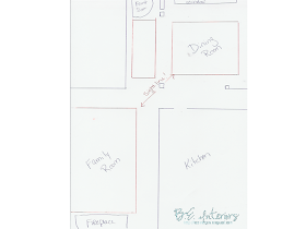
My goal was to neutralize my dining room...using the same general color scheme but in a totally different way for as little as possible. The issue is that the family room, dining room and foyer are all open to each other meaning you have to keep the sight lines in mind when picking finishes and colors. It's all got to tie together. But, one thing after another kept going wrong. The only parts that went right from the beginning were the blue ceiling and chandelier remake. Which, honestly... are the best things that could go right. Neither were easy. The chandelier was to be my big focal point and it's the only thing I couldn't have done on my own. The rest I can handle "solo".
So, I just put the brakes on the other day and spent forever with a notebook and a pen.
 |
| Floor plan. Notice the how you see the family room from the dining room and the foyer is essentially a part of the dining room. The red represents rug placement to create some separation. |
I listed every possible option that had crossed my mind for decor combos, then methodically narrowed it down based on a couple of things: budget, time, existing pieces and colors, etc. until I had the biggest WOW factor for the least amount of money. When I was done, I'd done a near 180°! Here's where I've been and gone:
- Planned strie/dragging wall treatment...to solid. After I started the main wall, I stepped back to look at it and I realized there was just too much going on in the room for that to work. Too busy. So, back to white walls. Leave it white or paint new color?
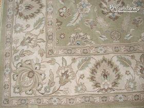
- Planned dining rug became no dining rug for now and new foyer rug! Long story short...found a brand new premium 5'x7' at the outlet up the road for 75% off!!!!!! Great colors and went great with existing family room which is directly connected. So, bought it for $50 ($400+/- new) and LOVE it! Adds the richness the room was lacking (remember...dining and foyer are all open space separated only by columns).
- Color scheme planned was based on mainly blue & white...now based on new foyer rug. Loving it!
- Curtain fabric was short 1 yard, so changed them up. May be changing again to coordinate better with new rug. Haven't decided yet.
- Slipcovers fabric has completely changed.
- My boys art work (shown at top) was to stay front and center...now they are creating new art work and the existing piece is moving to the family room.
Until then, you're in the dark and stayin' that way. I'll leave you with a peek at the two rugs I picked between for the foyer (yes...I didn't just buy one! I bought TWO! The one not used will go to the booth...it was that good of a sale!).
 |
| Rug option #1 |
 |
| Rug option #2. |
Aren't I just a booger?!

p.s. If you like what you read, become a follower and/or receive a subscription to your email courtesy of Feedburner! See my blog side panel for both. I love my readers!

I swear, I was going to ask where you got that gorgeous painting! Soooo cool!
ReplyDeleteStacy
Well, great! Now we have NO idea what you are doing! lol I love the artwork though..it is a perfect piece and how wonderful that your son did it! Perfect!
ReplyDeleteLove both rugs and I would probably keep the top one for myself~xo Diana
I think you picked option 1 because of the blue in it. Am I right?
ReplyDelete