Wednesday, January 25, 2012

Wine Bottle Pendant

Once again, I'm dying to try my hand at another knock-off idea. Have you seen these beauties in Ballard Designs catalog?

Addie Pendant from Ballard Designs
$129.00

Does this remind you of anything?

According to the description, the idea came from looking at old bottles.


Now, the minute I saw this, I remembered seeing a bottle shaped almost identical. That's the way my mind works. I notice shape, form and color of everything! I'm constantly looking at and taking mental notes of items that catch my eye. The object that came to mind was a cheap wine bottle...Livingston.


They have a great shape with no handle!
via The Wicker House
The bottle reminds me of old apple cider vinegar bottles. I'll never forget that shape. When I was a little girl, my grandmother bought some and poured me a glass thinking it was apple JUICE! I've never much cared for the stuff since!

Anyhoo, the shape is perfect. With a bottle cutter,

via Silver Art Glass Jewelery 

via Everything Stained Glass


some silver stained glass taping,

via Etsy


a pendant kit with possibly some kind of extension for the socket to get it low enough into the bottle that a bulb could be screwed into it,

via Electrical Hardware Store
$19.97
(you can get something similar for $14+/- at Home Depot or Lowe's)

and possibly some glass paint,

via Life123 

you have yourself a copy cat! And you don't have to settle for just one of four colors.

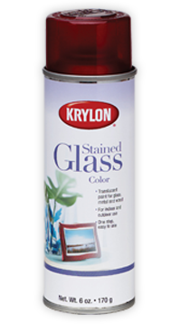
I'm thinking a metallic shade or a color mixed with silver and thinned with a glaze (see link on image above for mixing info). Roll it all around inside the bottle, then leave it to dry. Or try a stained glass spray paint like this:

via Krylon 


Cut the bottle, add the silver edging and pendant kit, and wha-la! Your very own Addie Pendant for about half the cost of a ready made one. Now, if I can only find time to actually make one!

Like what you see? Please let me know! Support my blogging by becoming a follower.

Tuesday, January 24, 2012

Anderson Interiors Inspiration

Oh, to have a cold lemonade and feel the sun on my face!


I don't know about you, but this time of year I start to get REALLY tired of rainy, dark, cold dreary days and start to long for springtime. It's actually kind of pathetic since winter just started and I live in the deep south! But...it is what it is. This is when I start dreaming of the beach, warm sun on my face and flip-flops on my feet.

That said, I started looking for a little inspiration to keep my outlook sunny even if we haven't actually seen the sun in days around here! Naturally, that means I head for Charleston, SC and start checking out designer's websites.

Let me introduce you to Anderson Interiors . They specialize in all styles of upscale interiors, but seem largely focused on traditional spaces, which I always find inspiration in if they are done well. There is a classic timeless elegance in their work. See for yourself:

Incredibly elegant!

Traditional and classic. Never dated.

What a great shade of blue!

How would you like to see this out your back window?

I'm thinking there MIGHT just be enough room here for my workshop (house, etc)?!

What a great banquet.


Yep. I'm thinking I could deal just fine with this every morning:)


What a great ceiling!


Oh,  my word! Does it get any better than this?!


This is just my speed.


Oh, so relaxing.

Loving those windows and all that natural light.

This has my name written all over it. 


How great is this touch of pink?


 Yep. Think that did it. I'm feeling the clouds lift and the creative juices starting to flow.


Like what you see? Please let me know! Become a follower and support my blogging.

Monday, January 23, 2012

Face-lift on the Cheap: Part 1c

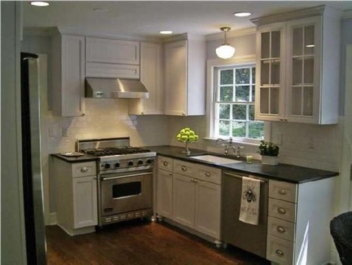
I love this kitchen! It completely inspires me. How about you?
via DecorPad


I've been a bad, bad blogger! In my rush to get this rental finished, I've neglected to take pictures! Shame on me. Did I mention this house I'm working on is two hours away and the only time I can work there on site is weekends?! So, I do my regular stuff & planning all week, then hop in the car and take off to work on the weekends when hubby and grandma can watch kids! Can you say pooped - tired - exhausted? Even so, I am very grateful for a job I enjoy so much:)

This is another image I'm really feeling inspired by as the layout is the same except there is no peninsula:

Designer Kitchens
via houzz.com

This weekend I installed a 2"x4" subway tile, brick pattern backsplash in "Biscuit" ceramic tile.

American Olean 12"x12" Biscuit - which is considerably whiter than this images appears!
via Lowe's


Total cost for materials was only about $150! Not too shabby and the difference it made is amazing. Granted, I went through every sheet and separated out an entire box of sheets with at least one broken tile, which I then was able to get for half-price as extras to the box and a half I bought of intact sheets. I've ask someone to go take some pictures, so I can show you. Hopefully, I'll get some soon. I did remember to take "before" pics after I'd started removing cabinet doors!

Fortunately, what I'm working on this week is refacing cabinetry. So, my car is currently loaded down with every cabinet door from the house! As soon as the veneer comes in, I'll post pics on the process and show you (hopefully - if all goes as planned) a quick and cheap update for old cabinets.


Like what you see? Please let me know! Support my blogging by becoming a follower.

Wednesday, January 18, 2012

Flor Creativity

"Needlepoint Stripe"


I'm completely obsessed with a product and have been for some time. Have you ever checked out Flor carpet tiles? The possibilities are endless! I think that is why I'm so in love with them.

"Martha Stewart Velvet Twist"

"Home Movies"


Somewhere around five or six years ago I discovered them, but was REALLY sceptical because all I could think about was the old carpet tiles that were around when I was a teenager. The ugly, hard, Berber, industrial things that I thought were incredibly ugly and uncomfortable.

"Finer Things"

"Coming Along"
LOVE this one and how it is the look of sea grass but super easy maintenance!


Then I discovered Flor. Ahhhhh! Carpet tiles....you have come a long way, baby!
"Martha Stewart Lattice"

"Crossroads"

If you know anything about me, it's that I love design. BUT, I am also a realist, frugal and very practical. One of the fantastic things about these babies are that you can pull up a tile to clean it or replace it. How much better can it get if:
1. you have kids,
2. you have pets, or
3. you entertain a lot!

"Arabesque"

"Sweater Weather"

The tiles aren't all cheap and your custom rug won't come out necessarily cheaper than a standard size rug, BUT when you factor in being able to save it by replacing one or two tiles versus the whole thing, it's worth paying the same or a little more for.

"Modern Mix"

"Suit Yourself"
Great sisal look!

Do you have any idea how many times I've pulled on the reins when contemplated buying an expensive rug because I couldn't bare to sink a small fortune into something that my sweet babies could ruin in a split second? My readers witnessed that as I contemplated a new rug for my dining room this summer!

"Sheer Indulgence"
"Weave a Story"
"Yeah, Baby!"
This is so fun, yet not overboard with the soft colors!

"Soft Spoken"

To top it off, their catalog has some great product shots in wonderfully designed rooms. So, I get inspired to design in other ways as well. And just so you know, Flor has no idea I'm writing this. It's not because I'm being paid to. I just really like this product and wanted to tell you about it:)


Like what you see? Please let me know! Support my blogging by becoming a follower.
Follow Me on Pinterest