Ready for your second round of
Group 3 Design houses? I'm telling you, I hit the jackpot with this find! Not only is there a ton of great houses to look at and get inspired by, but when you start following the links from their website you keep finding more great stuff to look at!
Anyhoo, enough yacking. Let's check out a few more houses!
 |
| While this is a beautiful home, I wasn't too interesting, until I saw the inside! |
 |
| What a room! the colors, the details, the VIEW! |
 |
| Gorgeous! That green teal is one of my favorite colors right now. |
 |
| I'm a sucker for lots of natural light...in case you've not noticed. |
 |
| How fun are these pops of turquoise? |
 |
| Lovin' this mirrored vanity and beadboard. |
This next house is great because of it's simplicity. When I first saw this picture, I thought it was a barn! Then, I fell in love with it's practical beauty. See for yourself.
 |
| How great is this driveway? You could throw a huge party and parking would NOT be an issue:) |
 |
| Another deep porch and shutter doors. What a great architectural touch! |
 |
Although probably not as photographically appropriate, I'd have to put me some big lounging wicker pieces
out on this wonderful porch because I'd be living out there! |
 |
| Practical beauty. |
 |
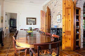
| Love how the brick is carried onto the entire wall and arches. |
 |
| Check out those doors and that floor! |
 |
I'm going to take a wild guess here. I'll venture to say this house is a modern interpretation of the old dog trot style home of the south. Dog trot style homes had a central hallway between the two big rooms that was open all the way through from front to back to allow breezes to pass through.
|
Last but not least, here is one more house that normally wouldn't necessarily catch my eye, but upon further evaluation, it stole my heart. The deck area and the inside made me swoon! It was love at first sight (sigh).
 |
| WOW! |
 |
| This took my breath away! |
 |
| The huge lantern, dark wood floors, X detailing and those fantastic mahagony (?) doors! Oh, la la! |
 |
| Again, great contrast with the ebony stain and white walls with sisal/seagrass runner. |
 |
| I'm thinking I could hang out here for a LONG time:) |
There you go. This finishes up the
Group 3 Design series. Did it get your creative juices flowing? Are you inspired now to go replicate some detail you saw or a color combo for finishes? I certainly did me!


I regularly pin images from your posts on Pinterest and today is no exception! You have such a great eye for gorgeousness...that bedroom with the dark wood beams is amazing!! Have a great weekend!!
ReplyDeleteThank you, Amanda! Isn't that room just to die for?! Have a great weekend as well:)
ReplyDeleteI'm like you, just can't get enough natural light. What an awesome idea to have the little windows over the top of the kitchen cabinets!! It is usually wasted space to either collect dust or junk or occasionally you'll see smaller cabinets up there for storage, but I like the windows. I might have to give that a try one day. :-) Love all the pictures, they do give me inspiration and something to dream over. HA!
ReplyDeleteRochelle